How to Build a Marketing Website That Converts: A Structural Blueprint
Most marketing sites are assembled page by page and hope the parts add up. This is the build plan instead: what each layer does, what order to build it in, and how to tell when a page is carrying its weight.

A marketing website has one job: turn attention into action. Not to look impressive, not to win an award — to move someone from "who are these people?" to "I'll get in touch."
Most sites fail at that because they were assembled rather than structured. Someone wrote a homepage, then a services page, then an about page, and the result is a set of pages that each make sense alone and don't add up to a path.
This guide is the build plan. It works from the offer outward — what each layer does, what order to build it in, and how to tell whether a page is earning its place.
If you already have a site and want to know what's wrong with it, that's a different job: the conversion diagnostic scores an existing site across eight areas and tells you what to fix first. Think of that as the inspection and this as the blueprint. If you're working out what a build like this costs, the pricing guide covers scope and budget.
CHAPTER 01 · Before any layout exists
What a marketing website is for
A visitor arriving cold runs through four questions in the first few seconds, roughly in this order:
- What is this?
- Is it for someone like me?
- Can I trust them?
- What do I do next?
The whole structure of a marketing site is an answer to those four, in that sequence. That's not a design principle — it's the order people actually need information in, and a site that delivers it out of order makes them work.
It's worth being clear about what a marketing site is not. It isn't a brochure that happens to be online, and it isn't a portfolio for its own sake. It also isn't a place to say everything true about your business. Most weak sites aren't missing information; they have too much of it, arranged without priority.
CHAPTER 02 · The framework
The Marketing Site Stack
Marketing sites work like a stack. Each layer rests on the one beneath it, and a weakness low down can't be fixed by adding more above it.
  Measurement   ← tells you whether any of it works
  Performance   ← decides who is still there to see it
  Action        ← what you want them to do
  Proof         ← why they believe you can do it
  Structure     ← how they find and follow the argument
  Offer         ← what you are actually selling, to whom
  ─────────────────────────────────────────────────────
Read it bottom-up, and build it bottom-up too.
If the offer is vague, better structure just organises the vagueness. If the structure is wrong, proof lands in places nobody reaches. If there's no proof, a stronger call to action asks for trust that hasn't been earned. Performance determines how many people are still present for any of it. And without measurement, you're guessing about all five.
Most redesigns start in the middle — new layout, new visuals — because that's the visible layer. It's the most expensive place to start and the least likely to change the outcome.
The rest of this guide is one chapter per layer.
CHAPTER 03 · Layer 1
Start with the offer, not the layout
You cannot structure a site around an offer you haven't defined. This is the step people skip, and it's why so many sites end up saying "full-service solutions for modern business."
An offer worth building around answers three things concretely: who it's for, what changes for them, and what you're asking them to do now.
Describes a category
- Full-service digital solutions
- Landscaping services
- Bookkeeping for small business
- IT support and managed services
Describes a change
- Fast marketing websites that get you calls and quote requests
- Yard maintenance that keeps your property inside HOA standards
- Bookkeeping for restaurant owners who are three months behind
- Same-day on-site IT support for dental practices
The right column is harder to write because it requires deciding who you serve. That decision is the actual work — the words are downstream of it. If you can't name the audience, no headline will rescue the page.
Two practical checks before you go further. Read your offer aloud to someone outside the business and see whether they can repeat it back. And write down what a visitor would have to believe for the offer to be compelling — those beliefs become your proof requirements later.

CHAPTER 04 · Layer 2
Structure: homepage, page types, and flow
The homepage sequence
A homepage is an argument, and arguments have an order. This sequence works for most service and B2B businesses:
- Outcome — what you do and who for, above the fold
- Context — a sentence that makes it concrete
- Early proof — one credible signal, near the top
- The problem — the situation the visitor recognises
- What you do about it — your approach, briefly
- How it works — process in three or four steps
- Deeper proof — case study, results, named testimonial
- The ask — a call to action that fits where they now are

This isn't a law. The order shifts with how much your audience already knows. A well-known local business can lead with proof, because credibility is assumed and the question is really "do you do this specific thing?" A new or technical offering usually needs the problem before the solution, because the visitor doesn't yet know they have the problem you solve.
What doesn't shift is the dependency rather than the running order: a high-intent ask needs enough context and proof in front of it. Low-friction asks — see pricing, view work — can sit early or in the navigation, and proof can lead when credibility is the question the visitor actually arrived with. What rarely works is asking someone to book a call before they know what you do or why you'd be any good at it.
Every page needs a job
| Page type | Its job | Needed when |
|---|---|---|
| Homepage | Orient, qualify, route | Always |
| Service pages | Sell one thing properly | You offer more than one distinct service |
| About | Build confidence in the people | Buyers choose partly on who you are |
| Portfolio / case studies | Prove you've done this before | Considered purchase, visible outcomes |
| Pricing or scope | Qualify and pre-answer cost | You lose time to unqualified enquiries |
| Contact | Remove friction from the ask | Always |
| Landing pages | Serve one campaign, one audience | You run ads or targeted outreach |
| Resources / blog | Earn search visibility, answer questions | You have search demand to capture |
| FAQ | Handle repeated objections | The same questions cost you calls |
A page without a clear job is usually inherited — built because sites "have" one. Every extra page dilutes navigation and adds something to maintain, so the bar for adding one should be a question it answers that nothing else does.
Navigation should help people decide
Navigation is not a table of contents for your org chart. It's a set of routes for the two or three decisions visitors actually make.
Keep the primary navigation to what people need to choose between — usually services, proof, and contact. Use the words your customers use rather than internal labels. And resist the urge to surface everything: a nav with eleven items makes people read instead of choose.

Content hierarchy and scanning
People scan before they read. Structure for that: descriptive headings that carry meaning on their own, short paragraphs, and the important sentence first rather than saved for the end.
A useful check is to read only the headings of a page top to bottom. If that alone tells a coherent story, the page will survive scanning. If the headings are labels like "Our Approach" and "Why Us," it won't.
Landing pages are a different animal
A landing page and a service page look similar and are built for opposite situations. Confusing them is why campaign traffic so often converts badly.
Core service page
- Serves everyone who arrives at that service
- Full navigation — visitors may still be exploring
- Ranks in search and gets linked to
- Answers a broad range of questions
- Lives as long as you offer the service
- Several ways forward, one of them primary
Campaign landing page
- Serves one audience arriving from one message
- Navigation often reduced — they came to do one thing
- Usually not indexed; traffic is paid or direct
- Answers only the objections that audience has
- Lives as long as the campaign
- One action, repeated
The rule that matters: a landing page should continue the sentence the ad started. If the ad said "emergency AC repair, same day," the page must open with emergency AC repair and same-day availability. Sending that click to a general services page makes the visitor re-find what they were promised, and most won't.
Don't build landing pages until you're running campaigns that need them. They're cheap to add later and expensive to maintain as orphans — a set of near-duplicate pages nobody updates is a genuine liability, both for maintenance and for search.
CHAPTER 05 · A constraint, not a layer
Build for the phone first
Most visitors arrive on a phone, and a phone imposes real constraints rather than just a narrower canvas.
The screen is small, so less fits above the fold and long paragraphs become walls. Input comes from a thumb with a much larger contact area than a cursor, so tightly-spaced targets get mis-tapped, and one-handed use puts the comfortable zone in the lower half of the screen. Browsing happens in short bursts, often on a poor connection.
What that means for the build:
- ✓Decide the mobile content order deliberately — it is not always the desktop order stacked
- ✓Put the primary action within thumb reach, not only at the very bottom
- ✓Give tap targets real size and space between them
- ✓Use the right input types so the correct keyboard appears
- ✓Make the phone number tap-to-call on every page
- ✓Keep overlays dismissible on the first attempt, and never stack them
- ✓Break text into blocks that can be scanned in a few seconds
Sticky elements are worth a note. A sticky call-to-action bar can genuinely help on a long page, and it costs vertical space on a small screen. Use one when the page is long enough that the action would otherwise scroll away, and skip it on short pages where it just covers content.
The failure mode to avoid is designing at desktop width and compressing. That produces a site that is technically responsive and unpleasant to use.
CHAPTER 06 · Layer 3
Proof, placed where doubt appears
Proof isn't a section of a website. It's a response to a specific doubt, and it works best next to the thing that caused it.
The most common mistake is collecting every testimonial onto one page. That page asks a hesitant visitor to leave what they're doing, go looking for reassurance, and come back — and hesitant people don't go looking.
Place it by stage instead:
Early — establishing credibility. Near the top of the homepage, one strong signal that this is a real operation serving people like them. A named testimonial, a linked review count, or a genuine result beats a row of logos.
Contextual — next to claims. If a service page says you're fast, the evidence for fast belongs beside it. An unsupported claim doesn't sit neutrally; it invites the reader to discount the rest of the page.
Deep — for people close to deciding. Case studies with the starting problem, what you did, and what changed. These belong lower in the journey, where someone is doing real evaluation.
Structural — process and expectations. Explaining how you work, what happens after contact, and what the client is responsible for is a form of proof. It shows you've done this often enough to have a process.
Strength tracks specificity. A named testimonial describing a particular situation and result carries more weight than five anonymous ones. "Twenty years of combined experience" is hygiene, not persuasion — necessary to state, insufficient to convince.
CHAPTER 07 · Layer 4
Calls to action, and the friction behind them
CTA strategy, not CTA labels
Most advice about calls to action stops at wording. The wording matters least.
Primary CTA — the one action a page exists to produce. One per page. If a page has three equally-weighted actions, the visitor has to decide which matters before doing anything, and that decision is work you handed them.
Secondary CTA — a lower-commitment alternative for people who aren't ready. See pricing, view work, read a case study. Its job is to keep someone who would otherwise leave.
High-intent CTA — book a call, request a quote, start a project. Appropriate deep in a service page or after substantial proof.
Low-friction CTA — see examples, check pricing, get a guide. Appropriate early, in navigation, and on content pages where the visitor is still orienting.
Match the CTA to the page's job. A blog post about a technical question shouldn't lead with "book a consultation" — the reader came for an answer, and the honest next step is something smaller.

Repeat a CTA when the page is long enough that the previous one has scrolled away. Don't repeat it three times on a short page, and don't repeat it immediately after proof that hasn't been read yet.
Then say what happens next. One line under the button — we reply within one business day, or no obligation, and we'll tell you if we're not the right fit — answers the question that stops people. The button asks; the line beneath it reassures.
Forms are where the ask actually happens
A good CTA in front of a bad form loses the enquiry anyway. The first-contact form is where most service businesses leak, almost always for the same reason: it's built around what the business wants to know rather than what's needed to start a conversation.
Ask only what's required to reply usefully. Name, a way to reach them, and one open field is enough for most businesses. Company size, budget range, how they heard about you and preferred contact window can all be asked once someone is talking to you.
- ✓Cut every field you don't need to send a useful first reply
- ✓Label fields visibly — placeholder text disappears the moment someone types
- ✓Set input types so phones show the right keyboard
- ✓Validate as people go, and say what's wrong in plain language
- ✓Never clear the form on an error
- ✓Show a real confirmation state, not a silent page reload
- ✓Tell them what happens next and when
- ✓Send the enquiry somewhere a human actually checks
Progressive qualification is the pattern that reconciles the tension: ask little to start the conversation, then gather what you need once there's a conversation to gather it in. A budget dropdown on first contact asks a stranger to disqualify themselves before they know what things cost.
CHAPTER 08 · Layer 5
Performance is part of the experience
Speed matters because of what it does to the sequence, not because fast is a virtue in itself. A page that takes six seconds to show its headline has spent six seconds not communicating, and some visitors leave in that window having learned nothing about you.
It also reads as a credibility signal. People don't diagnose why a site is slow; they just form an impression from it.
Google's Core Web Vitals give three thresholds worth building against. Each is assessed at the 75th percentile of real visits, and mobile and desktop are reported separately — a site can pass on one and fail on the other, which is why checking on your desktop isn't enough:

In practice, most of the recoverable time on a marketing site is in a few places: oversized hero images, third-party scripts that accumulate quietly, fonts that block text from rendering, and images without dimensions that make the layout jump while loading.
Two of those you can act on without a developer — auditing which analytics, chat and pixel scripts are still earning their place, and compressing images to the size they actually display.
Don't chase a perfect score for its own sake. A site at 90 that shows its headline immediately serves people better than one at 100 that took three rounds of tuning.
CHAPTER 09 · Layer 6
Build it so you can tell whether it works
A marketing site you can't measure is a marketing site you can only have opinions about.
You don't need an analytics practice. You need enough instrumentation to answer: are people arriving, are they getting to the pages that matter, are they starting the actions you built, and are they finishing them.
- ✓Form submissions, separated by which form
- ✓Form starts as well as completions — the gap tells you the form is the problem
- ✓Phone number taps
- ✓Booking or scheduling completions
- ✓Primary CTA clicks on the pages that matter
- ✓Which page someone was on when they converted
- ✓Traffic source, at least at the channel level
- ✓A manual note of which enquiries turned out to be worth having
That last one requires no setup and is the most valuable. Forty enquiries producing two useful conversations is a very different situation from four producing three, and no analytics tool will tell you which you're in.
Set this up before you start changing things. Instrumenting after the fact means the first month of results has nothing to compare against.
CHAPTER 10 · Knowing the edge of the map
When it stops being a marketing website
Marketing-page architecture stops being the right model at a fairly clear boundary. If the project needs any of these, you're no longer structuring pages — you're building software:
- User accounts and logins
- Dashboards showing data back to the user
- Workflow logic with states and transitions
- Roles and permissions beyond edit-the-site
- Operations your team runs day to day
- Multi-step processes that save progress
The signal is that the site starts having users rather than visitors. Visitors read and act; users log in and do work.
This matters for how you plan and budget it. Page count stops predicting effort, and the cost drivers become data models, roles and integrations. If that's where you're heading, the SaaS MVP cost guide is the better map, and the website pricing guide explains where the boundary sits in budget terms.
Plenty of businesses need both: a marketing site that wins the customer, and an application they then log into. Build them as two things with a clear seam rather than one thing that's confused about which it is.
The build checklist
Working order, bottom of the stack up:
- ✓Write the offer: who it's for, what changes, what you're asking
- ✓List what a visitor must believe — those become your proof requirements
- ✓Map the pages, and give each one a job it alone does
- ✓Draft the homepage sequence before any visual design
- ✓Write the headings first and check they tell the story alone
- ✓Decide the mobile content order deliberately
- ✓Place proof next to the claims and decisions it supports
- ✓Choose one primary action per page, plus a lower-commitment option
- ✓Cut the contact form to the fields you genuinely need
- ✓Say what happens after someone submits, and mean it
- ✓Set image dimensions, compress media, audit third-party scripts
- ✓Instrument CTA clicks, form starts and form completions before launch
- ✓Test the whole path on a real phone, on cellular, as a stranger
How this guide differs from our others
This guide is the build plan — how to structure a marketing site so the parts support each other.
Why Your Website Isn't Converting is the inspection. Use it on a site you already have to find what's broken and what to fix first.
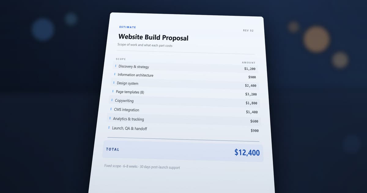
How Much Should a Website Cost? covers scope, budget and how to read a proposal for work like this.
What Drives the Cost of a SaaS MVP takes over once the project crosses into application territory.
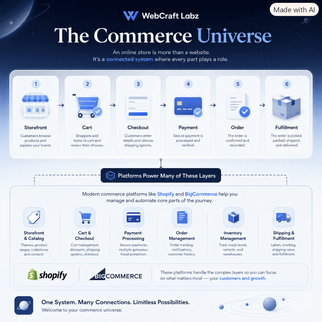
Commerce 101 is where to start if you're selling products rather than services — platform options, store vocabulary, and what each setup commits you to.
Key Takeaways
- A marketing website has one job: turn attention into action. Structural decisions either serve that or compete with it.
- Build bottom-up — offer, structure, proof, action, performance, measurement. A weak layer can't be fixed by adding more above it.
- You can't structure a site around an offer you haven't defined. Naming the audience is the actual work.
- Every page needs a job it alone does. Pages without one dilute navigation and add maintenance.
- Proof belongs next to the doubt that prompted it, not collected onto one page nobody visits.
- One primary action per page, plus a lower-commitment option for people who aren't ready.
- Ask only what you need to reply usefully. Everything else can wait until there's a conversation.
- Instrument the site before you start changing it, or the first month of results has nothing to compare against.
Your next step
If you're planning a build, work down the checklist above in order. Most of the value is in the first four items, and none of them require a developer.
If you already have a site and want to know which layer is failing, run the conversion diagnostic — it scores the same territory and tells you what to fix first.
If you want a number for a build like this, the build calculator gives a real range in a couple of minutes, and the pricing guide explains what moves it.
If you'd rather talk it through, tell us what you're building, or look at recent work to see how these structures come together in practice. We also build this kind of site directly — custom website development is the service that does it.
Build Something Better
Ideas deserve a better home than a generic blog.
WebCraft Labz builds fast, polished websites for businesses and creators who want their ideas to feel premium from the first scroll.
Start a ProjectContinue Reading